Visualizing the magnetic field of nanoparticles with Python
Note: The following is a continuation on this post on electron holography, which I suggest reading first to get a sense of what is going on.
As you have probably seen before, magnets and their magnetic fields are often visualized as field lines like in the figure below1 which represent how the magnetic field extends outside a rectangular magnet

This is a common illustration used for magnetic fields, where magnetic field lines are drawn along lines of constant field strength – A sort of contour lines for the magnetic field strength. If we were to place a tiny compas at any position outside the magnet, the compass needle would align itself to the direction of the field lines at this position.
This is usually presented for magnets large enough hold in your hand, but it is actually possible to directly measure the magnetic field of nanoparticles in a Transmission Electron Microscope (TEM), just like this:
The TEM uses electrons as a probe to image particles, and electrons moving in a magnetic field will get affected by it. Information about the magnetic field of a sample can be saved using a technique known as Electron Holography which preserves the phase \(\phi\) of the electrons in the acquired image.
Reconstructing the above image from raw holograms involve a few different image processing techniques including Fourier analysis, frequency filtering and image matching to find the translational shift between two almost identical images, as well as other image processing techniques.
In this post I walk through all the Python code used to go from a raw hologram to a magnetic phase image such as the above. You can see the full code in this Jupyter notebook, which you can download along with the holograms if you want to play along yourself.
All the data shown was acquired as part of my bachelors thesis2 at DTU Nanolab (previously Center for Electron Nanoscopy) several years back and follows the procedure detailed in this book chapter3. I recently went back to revisit the subject to redo it in Python out of curiousity and decided do this writeup to share with anyone why might be interested.
Calculating phase image from a hologram
Importing microscope data
We start out with some common packages for scientific Python, namely numpy and matplotlib4. We use pyplot for plotting and will set some default parameters with plt.rcParams so we don’t have to do manually for each plot.
# Import numpy and fft functions directly
import numpy as np
from numpy.fft import fft2, ifft2, fftshift

# Set some default parameters for the plots
import matplotlib.pyplot as plt
plt.rcParams['figure.figsize'] = [16, 8]
plt.rcParams['figure.frameon'] = False
plt.rcParams['image.cmap'] = 'gray'
The raw data from the microscope is saved in dm3 files, a common format used in electron microscopy. It is usually opened with the proprietary Gatan Digital Micrograph software or a program like ImageJ which can be difficult to work with for more complex calculations, but luckily the OpenNCEM project allows us to open it in Python (look here if using Matlab).
from ncempy.io.dm import dmReader

# Load dm3 files for a particle and reference
dmdata1 = dmReader('data/h05 +30sat.dm3')
dmdata1r = dmReader('data/h06r +30sat.dm3')

# Extract image data
im1 = dmdata1['data']
im1r = dmdata1r['data']
The raw image in im1, our hologram, looks like this
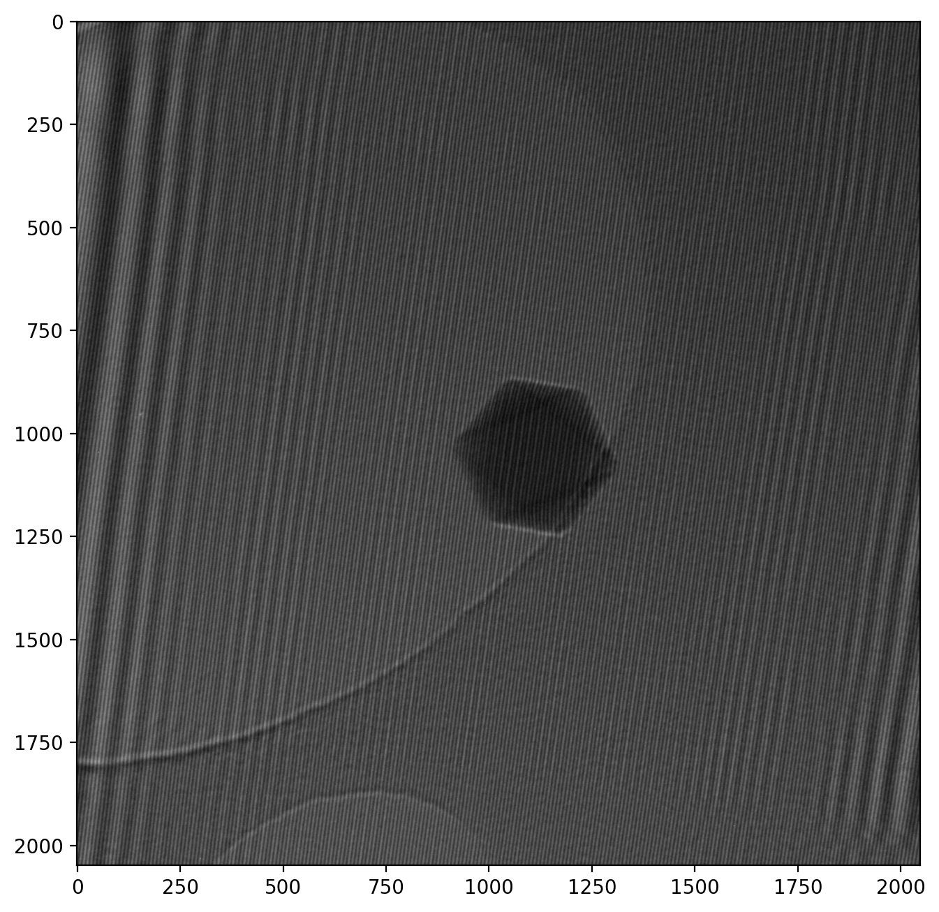
Note that the numbered axes show pixel numbers instead of nanometers. We keep it this way for now as it helps illustrate the numerical calculalations we will be doing. However, it is still important to provide a scale when showing microscope images, and it is readily available from the metadata:
print('Scale from metadata: 1 px = %s %s' %(dmdata1['pixelSize'][0], dmdata1['pixelUnit'][0]))>> Scale from metadata: 1 px = 0.0037131761 µmSo 1 px = 0.0037 µm, but: the scale is off by a factor 10 in these specific images. This is because the objective lens (the one that forms the image) is the special Lorentz lens, and the correction has not been included correctly in the metadata. We will correct for this and convert to nanometers while we’re at it:
# Redefine to nm and correct for Lorentz lens factor 10 error
pxsize = dmdata1['pixelSize'][0] * 1000/10
pixel_unit = 'nm'
print('Corrected scale: 1 px = %.4f %s' %(pxsize, pixel_unit))
print('Field of view: %.2f nm x %.2f nm' %(im1.shape[1]*pxsize, im1.shape[0]*pxsize))
>> Corrected scale: 1 px = 0.3713 nm
>> Field of view: 760.46 nm x 760.46 nmThe image is thus 760 nm from one side to the other, and the particle is about 90 nm wide.
There is a wealth of other information in the metadata such as acceleration voltage, magnification etc. which can be accessed with the fileDM method from ncempy if needed.
Fourier Transformed hologram with sidebands
We can now calculate the Fast Fourier Transform (FFT) on our hologram of the particle using fft2 from numpy. We also use fftshift which centers the main peak in the image, as it is otherwise split into the corners for numerical reasons.
# Transform image, ready for visualization
im1_fft = fftshift(fft2(im1))
im1_fft_abslog = np.log(np.abs(im1_fft))

# Adjust colormap to increase contrast
vmin_fft = np.amin(im1_fft_abslog)*3
vmax_fft = np.amax(im1_fft_abslog)*0.8

plt.imshow(im1_fft_abslog, vmax=vmax_fft, vmin=vmin_fft)
plt.xlim([600, 1448])
plt.ylim([1448, 600])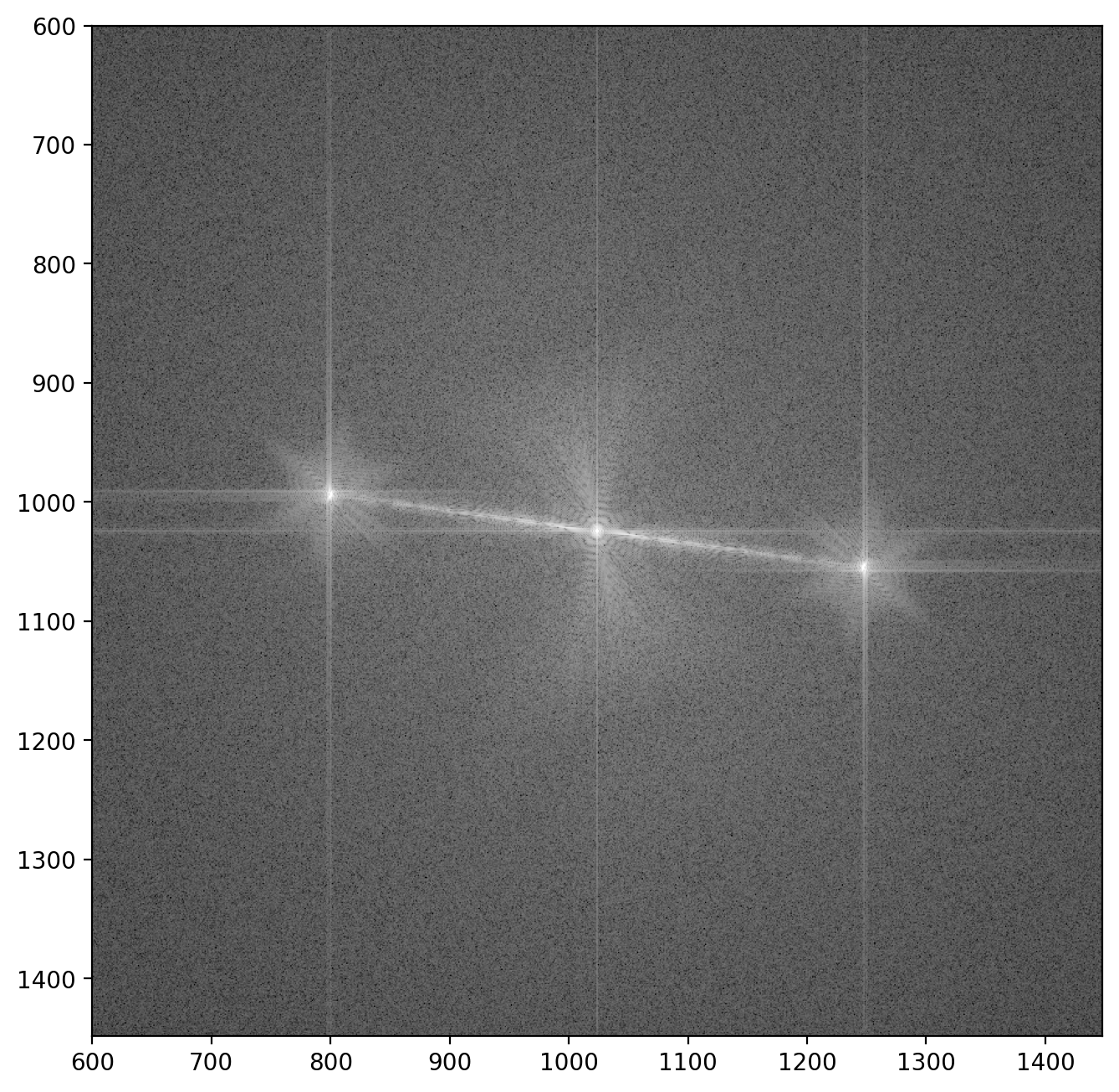
Here we see the central peak with the two “sidebands” off to the sides5. Each sideband contains both the amplitude of the wave which passed through the sample and the reference wave \(A_i(\vr)\) and \(A_r(\vr)\) respectively, as well as the electron phase \(\phi(\vr)\):
\[\hat{I}_\mathrm{s.b.}(\vq) = \fourier{A_i(\vr)A_r(\vr)e^{i\phi(\vr)}}\]Here \(\vr = (x,y)\) refers to a given point (or pixel) in the image. The next step in isolating the phase image \(\phi(\vr)\) is then to extract one of the sidebands.
Extracting a sideband
The FFT image contains three significant peaks, namely the central one (by far most intense) and the two sidebands (similar intensity). Each sideband is almost identical, with the important difference being that they are complex conjugates of each other - This means a phase image calculated from one sideband will correspond exactly to the phase image from the other sideband with opposite sign.
To select a sideband, we will find coordinates of the peaks in the image using peak_local_max from the scikit-image package exactly like in this example. As the central peak is always strongest we simply find the second strongest peak and check if it’s a positive or negative phase change, otherwise we take the third strongest. We write this into a function as we’ll do it a few times
from scipy.ndimage import maximum_filter
from skimage.feature import peak_local_max

def peak_coordinate(image_fft, peak_number=0):
    # Find the peaks
    im = np.abs(image_fft)
    image_max = maximum_filter(im, size=200, mode='constant')
    coordinates = peak_local_max(im, min_distance=200)

    # Get values of peaks and sort, get coordinates of second largest peak
    peaks = [image_fft[coordinate[0], coordinate[1]] for coordinate in coordinates]
    peaks_idx = np.argsort(peaks)
    coordinates_sorted = [coordinates[peak_idx] for peak_idx in peaks_idx]

    sideband_idx = coordinates_sorted[peak_number]

    # Choose sideband on the right side of the image
    if sideband_idx[1] < image_fft.shape[1]//2:
        sideband_idx[0] -= 2*(sideband_idx[0]-image_fft.shape[0]//2)
        sideband_idx[1] -= 2*(sideband_idx[1]-image_fft.shape[1]//2)

    return sideband_idx
We’ll wrap this into a function to automatically extract a sideband from a given FFT image. Note that the image is stored as a matrix where rows (up and down) are indexed before columns (left and right), meaning \(x\) and \(y\) must be reversed since we want a horizontal x-axis and vertical y-axis.
def extract_sideband(image_fft, width=128):
    sideband_idx = peak_coordinate(np.abs(image_fft))
    width = width//2
    x1 = sideband_idx[1]-width
    x2 = sideband_idx[1]+width
    y1 = sideband_idx[0]-width
    y2 = sideband_idx[0]+width

    sideband_fft = image_fft[y1:y2, x1:x2]

    return sideband_fft
We can now apply our new function and take a closer look at the sideband.
sideband_size = 200
sideband1_fft = extract_sideband(im1_fft, width=sideband_size)

plt.imshow(np.log(np.abs(sideband1_fft)))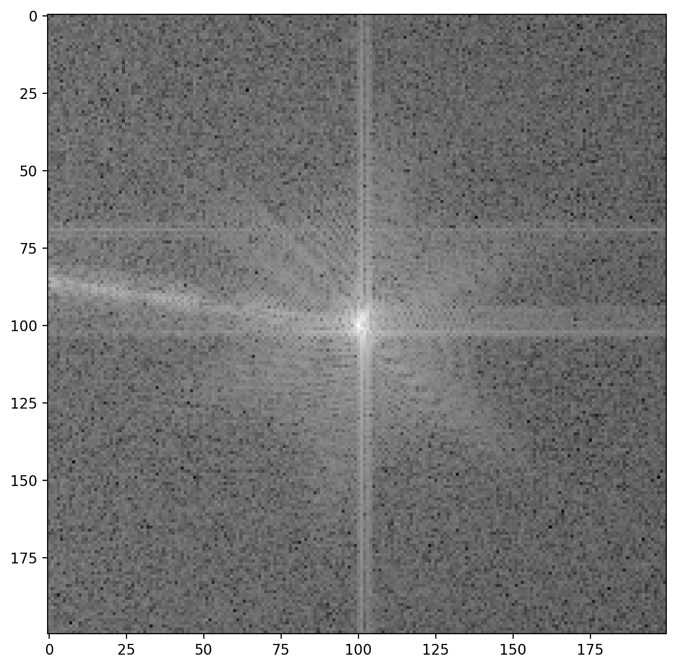
The vertical and horizontal streaks are artifacts which appear because our our original image is finite at the edges. When we decompose the image into its frequency components the sharp, abrupt change at the image have to be represented by many different frequencies, giving rise to these streaks. Later you will be able to see the the result of these artifacts in the reconstructed image along the very edges of the images but this will not affect our analysis otherwise.
Phase and amplitude from sideband
We are now ready to calculate the amplitude and phase of our image!
When performing a fourier transform of an image (real values), the FFT will contain complex values. Usually when the inverse fourier transform is applied we would get back the original image containing only real values. However, by cropping out the sideband we have redefined the center of the FFT image. Now when applying the inverse fourier transform to the sideband, the resulting image will contain complex values.
This is actually intended! We can find the “usual” intensity image from the absolute value of the complex number in each pixel as \(I = \sqrt{\mathrm{Re}^2+\mathrm{Im}^2}\) with np.abs (like when visualizing the FFT). The phase image is found from the angle of the complex number \(\varphi=\arctan\left(\frac{\mathrm{Im}}{\mathrm{Re}}\right)\) using np.angle.
# Calculate amplitude and phase of image
sideband1 = ifft2(fftshift(sideband1_fft))
sideband1_abs = np.abs(sideband1)
sideband1_phase = np.angle(sideband1)
Here’s the amplitude image
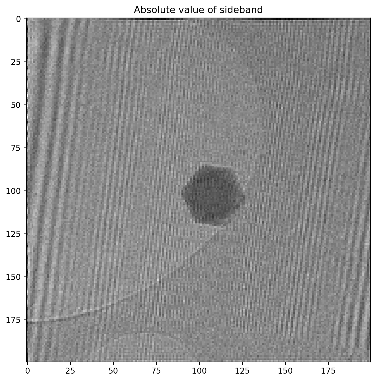
Note how the amplitude image is very similar to the original hologram, but in reduced resolution since we cropped it out as part of the full FFT image. The phase image looks like this
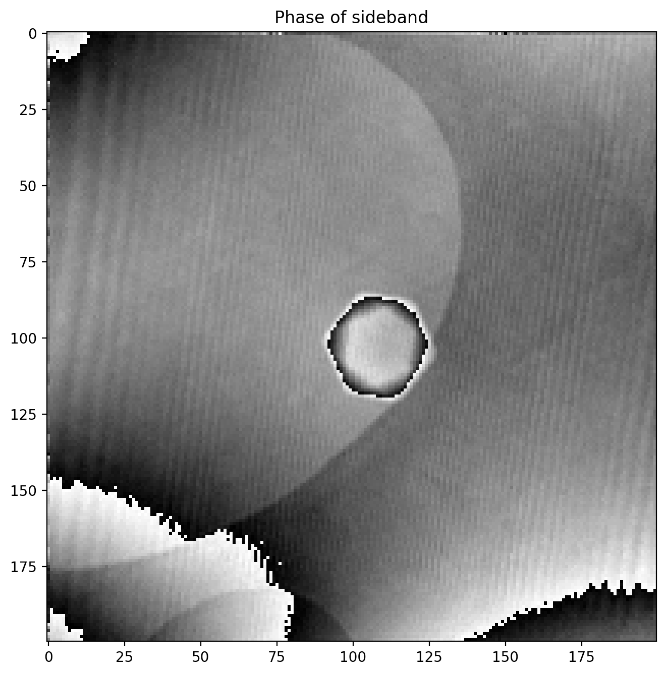
We immediately notice some odd artifacts in the form of sudden jumps in value. We calculated the phase (or angle) of the complex numbers with np.angle which is an implementation of atan2, a numerical version of the \(\arctan\) function which outputs an angle between \(-\pi\) and \(\pi\), and an angle is thus bound between these values.
This means that if a region of the phase image has a phase value extending above \(\pi\) for example, the value returned by atan2 will “wrap around” and return \(-\pi\) as it is does not know that it should be continuing the values of the neighbouring pixels.
Fortunately “unwrapping” phase images is a common procedure in image processing and scikit-image has it built into the unwrap_phase method:
from skimage.restoration import unwrap_phase
sideband1_phase = unwrap_phase(sideband1_phase)
Our phase image now looks like this
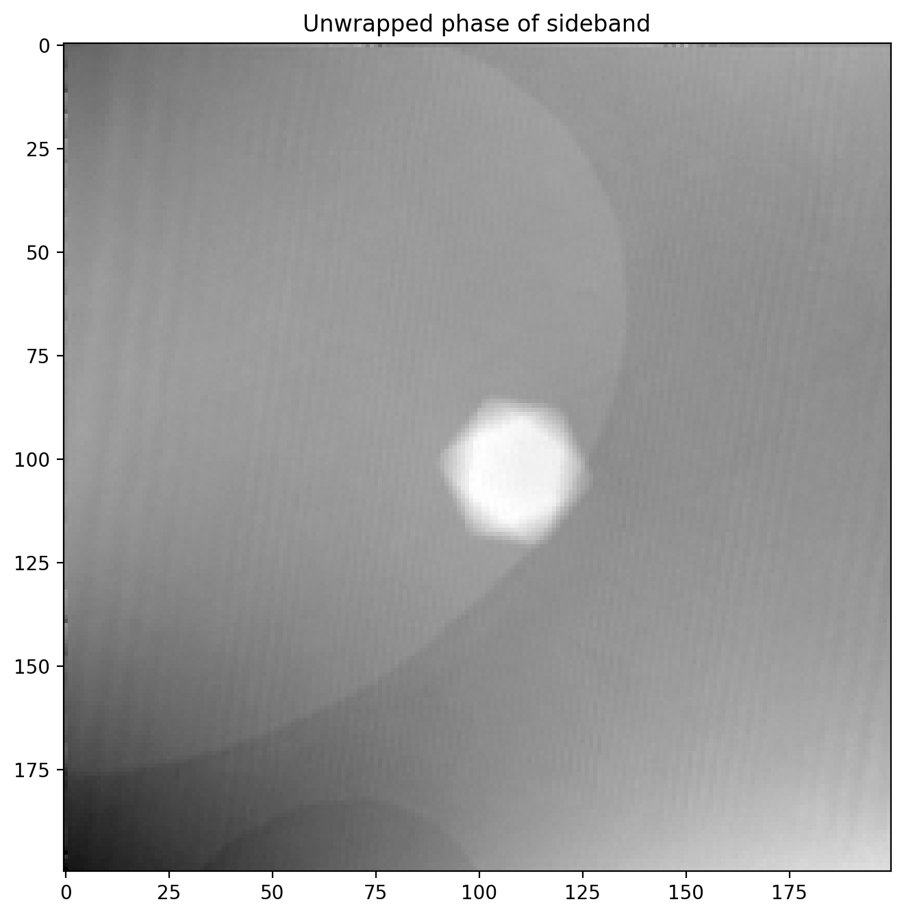
So far so good, we have succesfully recovered the full phase shift of the electron beam after passing through a nanoparticle! We will improve it a bit by subtracting a background reference before.
Correcting phase image with background reference
First we load in a reference background image which was acquired in an area without any sample present to get a clean background reference. Using the functions defined earlier makes quick work of extracting the sideband
im1r_fft = fftshift(fft2(im1r))
sideband1r_fft = extract_sideband(im1r_fft, width=sideband_size)

fig, (ax1, ax2, ax3) = plt.subplots(1,3)
ax1.imshow(im1r)
ax2.imshow(np.abs(np.log(im1r_fft)))
ax3.imshow(np.abs(np.log(sideband1r_fft)))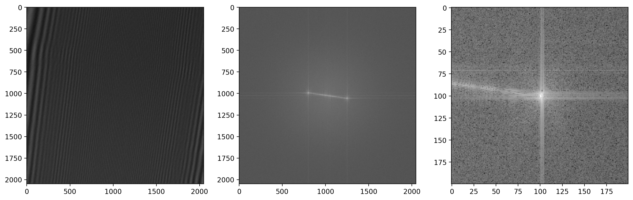
Now we calculate the phase of the reference image
sideband1r = ifft2(fftshift(sideband1r_fft))
sideband1r_phase = unwrap_phase(np.angle(sideband1r))

plt.title('Background reference phase image')
plt.imshow(sideband1r_phase)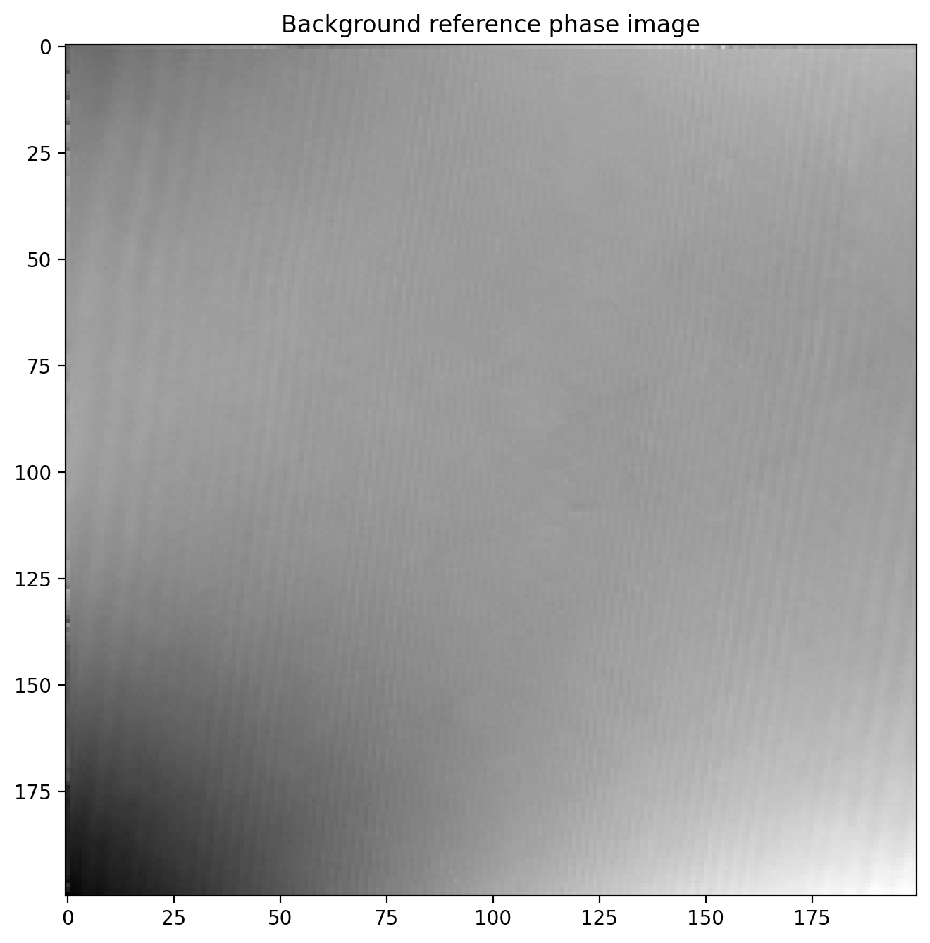
Finally we subtract the reference image which leaves us with a much more even phase image
phi1 = sideband1_phase-sideband1r_phase

plt.title('Corrected phase image of particle')
plt.imshow(phi1)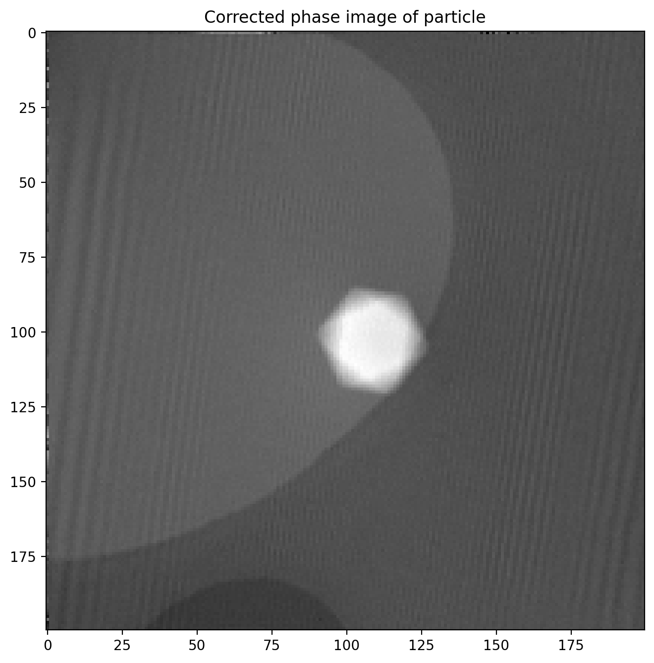
The magnetic phase shift still not easily visible as the electric contribution dominates the phase image.
Hologram of particle with reversed magnetization
In order to isolate just the magnetic contribution \(\phi_m\) to the phase shift we need an image of the exact same particle where the particle’s magnetization, and thus \(\phi_m\), is reversed. Since \(\phi_m\) changes sign while \(\phi_e\) is unchanged it is a matter of simple subtraction
\[\phi = (\phi_e+\phi_m) - (\phi_e - \phi_m) = 2\phi_m\]Then we just divide by 2, giving us the pure magnetic phase image \(\phi_m\).
The magnetic reversal is done by applying a strong magnetic field inside the microscope in the opposite direction of the previous used to magnetize the particle in the first place, using one of the magnetic lenses.
We load in the image and subtract a reference phase image just like before:
# Load data
dmdata2 = dmReader('data/h19 -30sat.dm3')
dmdata2r = dmReader('data/h17r.dm3')

im2 = dmdata2['data']
im2r = dmdata2r['data']

# Calculate FFT and extract sideband for image
im2_fft = fftshift(fft2(im2))
sideband2_fft = extract_sideband(im2_fft, width=sideband_size)
sideband2 = ifft2(fftshift(sideband2_fft))
sideband2_phase = unwrap_phase(np.angle(sideband2))

# Calculate FFT and extract sideband for reference image
im2r_fft = fftshift(fft2(im2r))
sideband2r_fft = extract_sideband(im2r_fft, width=sideband_size)
sideband2r = ifft2(fftshift(sideband2r_fft))
sideband2r_phase = unwrap_phase(np.angle(sideband2r))

# Subtract reference phase shift
phi2 = sideband2_phase-sideband2r_phase

plt.title('Corrected phase image of particle with reversed magnetization')
plt.imshow(phi2)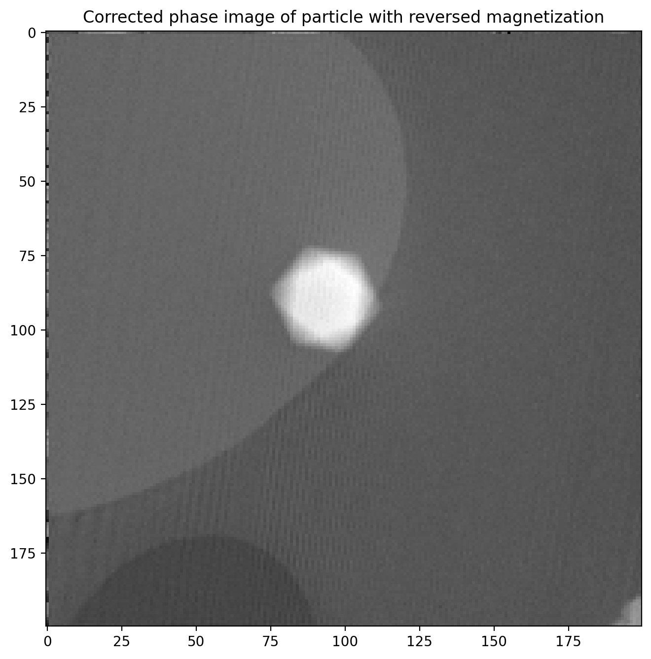
This phase image is almost identical to the first, but with two important differences: \(\phi_m\) is opposite of before, and the particle is in a slightly different position in the image. This means we cannot directly subtract the two images until we have found out exactly how much the particle position changed.
Matching two similar images to adjust for translation
There is a significant shift in x and y positions between the images, but only negligible rotation. This means we can use phase cross correlation to get a good estimate of the translation between images as implemented in phase_cross_correlation in scikit-image6. There is a decent example with details here. Knowing this shift we can correct for it and ensure the images have a common center so we can subtract them properly.
We start out by applying a bandpass with gaussian blur to remove some high- and low-frequency details which can detract from the image matching.
from skimage.filters import window, gaussian, difference_of_gaussians
from skimage.registration import phase_cross_correlation
from skimage import transform

# Bandpass with Gaussian blur
sigma1 = 1
sigma2 = 3
phi1_filt = difference_of_gaussians(phi1, sigma1, sigma2)
phi2_filt = difference_of_gaussians(phi2, sigma1, sigma2)

fig, ax = plt.subplots(1,2)
ax[0].imshow(phi1_filt)
ax[1].imshow(phi2_filt)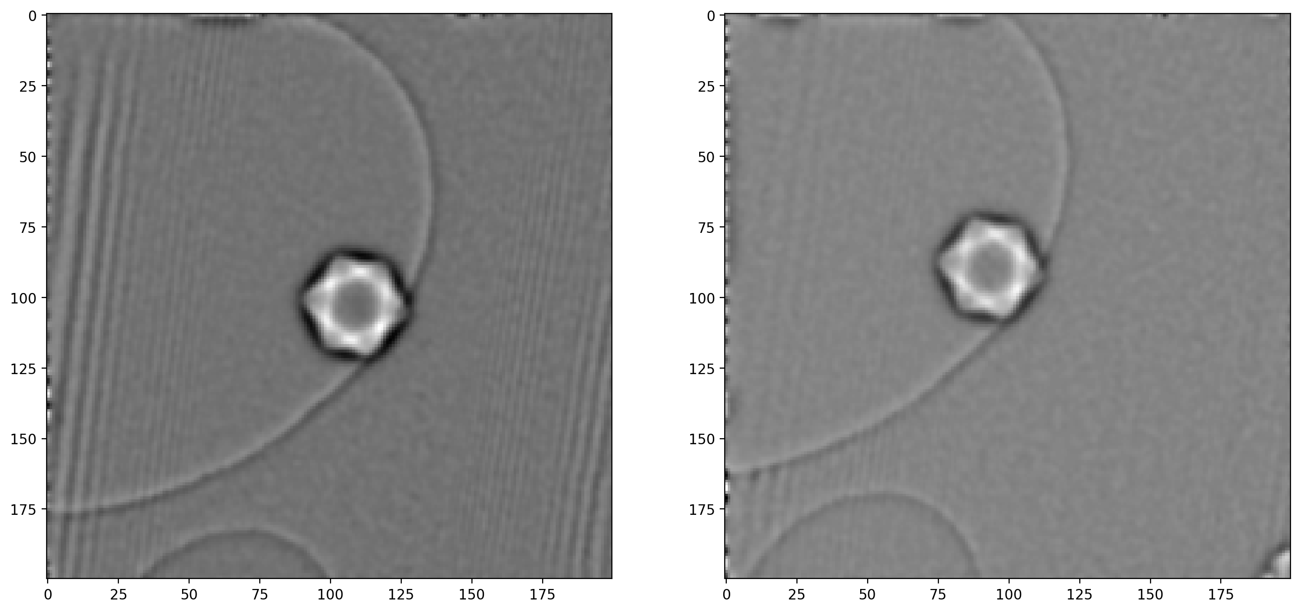
As noted when extracting the first sideband, there are significant artifacts along the edges of the image which can also cause issues – image edges are generally troublesome when dealing with frequency decompositions. For this reason we will construct a “window” and multiply with our images, which ensures all values go smoothly towards \(0\) at the edges.
# Apply Hann window to avoid border issues
window_type = 'hann'
window_image = window(window_type, phi1_filt.shape)
phi1_windowed = phi1_filt*window_image
phi2_windowed = phi2_filt*window_image

fig, ax = plt.subplots(1,2)
ax[0].imshow(window_image)
ax[1].imshow(phi1_windowed)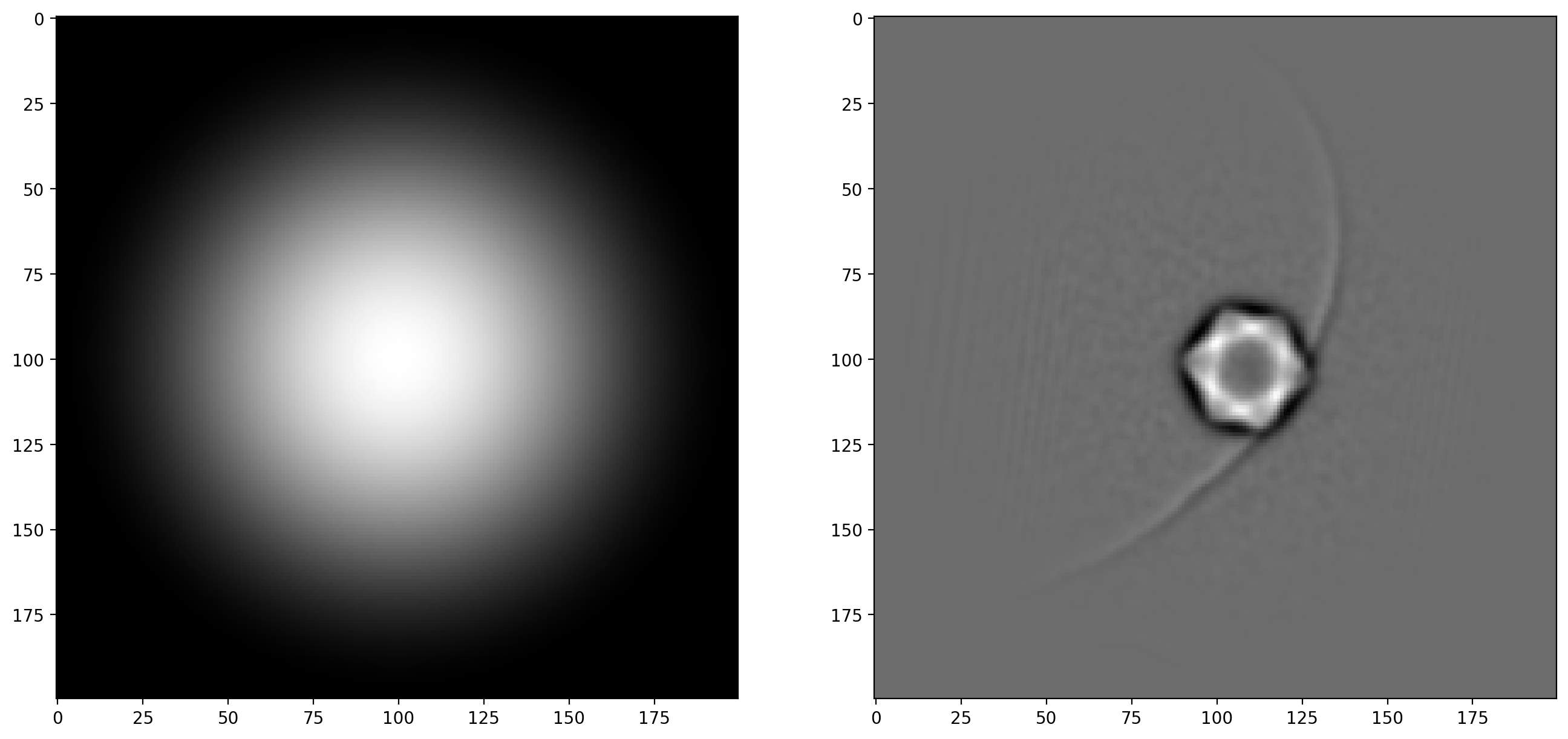
With the bandpass filter and window applied to both images, we are now ready to calculate the shift in x and y
# Calculate the shift using phase cross correlation on filtered images
shifts, error, phasediff = phase_cross_correlation(phi1_filt, phi2_filt, upsample_factor=100)

# Note that matrices are indexed as rows ("y") at [0] and columns ("x") at [1]
dx = shifts[1]
dy = shifts[0]
print('Translation: (dx, dy) = (%.2f, %.2f)' % (dx, dy))
>> Translation: (dx, dy) = (15.04, 13.14)The calculated translation is now applied as a geometrical transform to correct one of the unfiltered phase images. After this we can subtract one phase image from the other to isolate the magnetic phase shift (and remember to divide by 2).
# Translate the second unfiltered phase image for matching on top of the first
tform = transform.EuclideanTransform(translation=(dx, dy))
phi2_tf = transform.warp(phi2, tform.inverse)
# Subtract unfiltered phase images, remember division by 2!
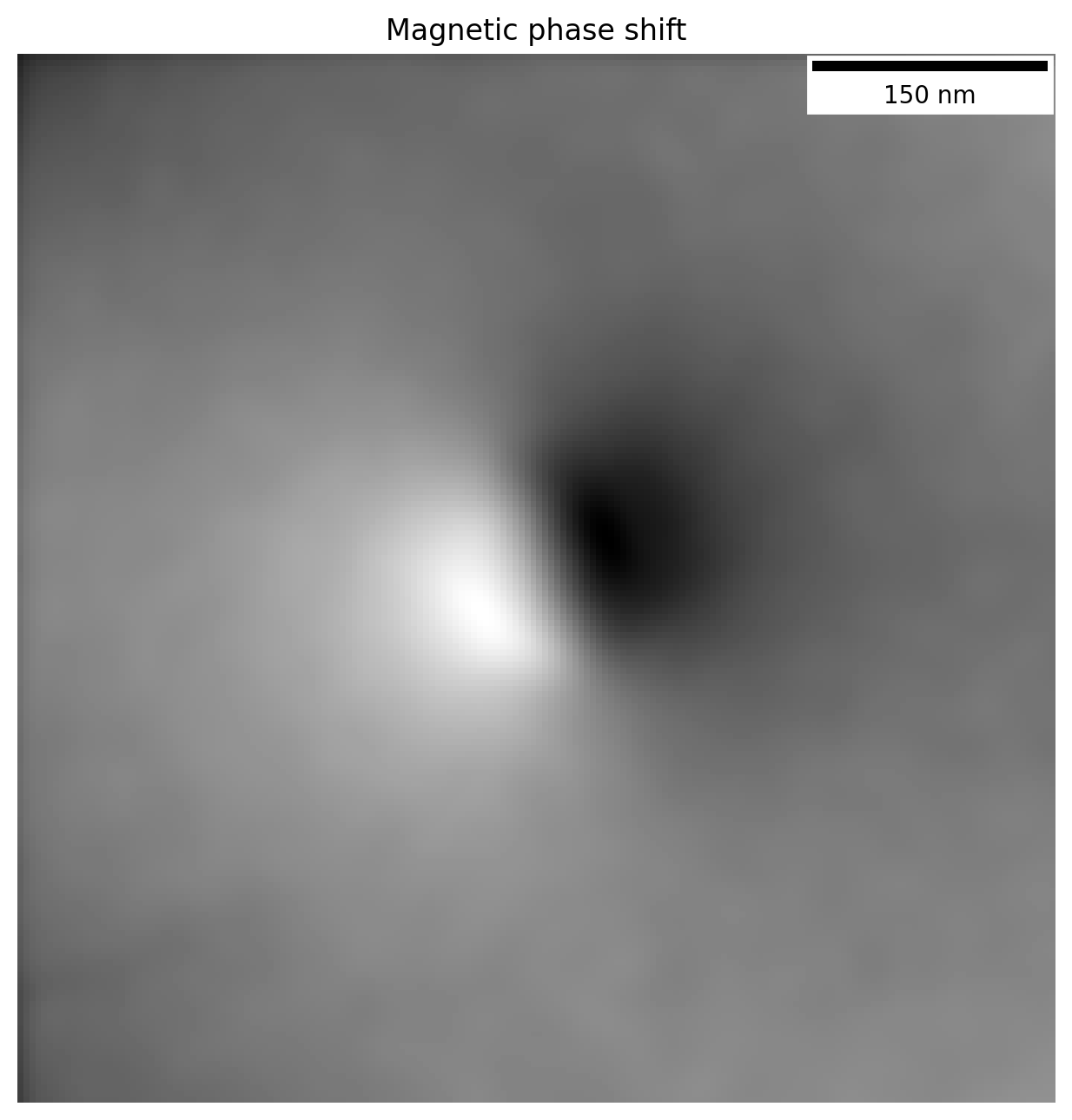
phi_m_raw = (phi1-phi2_tf)/2
plt.title('Magnetic phase shift')
plt.imshow(phi_m_raw)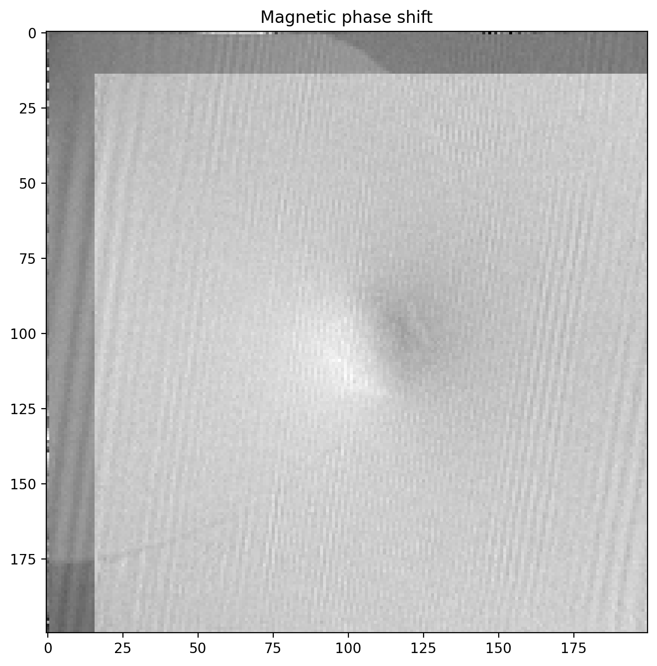
The magnetic phase shift has revealed itself! Note how there is a lighter region on one side of the particle and dark on the other. This is the magnetic contribution to the phase shift.
Magnetic field lines from phase image
We can enhance the magnetic phase image by cutting out the relevant part where the images overlap and filtering some noise away.
First we make a function to cut off the parts of the image that without overlap after subtraction
def crop_from_shifts(image, dx, dy, border=0):
    dx, dy = int(dx), int(dy)
    image = image[:, dx:-1] if dx >= 0 else image[:, 0:dx]
    image = image[dy:-1, :] if dy >= 0 else image[0:dy, :]

    border = int(border)
    if border > 0:
        image = image[border:-border, border:-border]

    return image
We can also filter the image a bit with a gaussian blur to reduce high frequency noise, since the magnetic field (and phase shift) only varies slowly across the image. We will also apply a scalebar to show the size of the features.
from matplotlib_scalebar.scalebar import ScaleBar

# Scale original pixel size to match resolution of phase image and add to scalebar
pxsize_phase = im1.shape[0]/sideband_size*pxsize
scalebar = ScaleBar(pxsize_phase, pixel_unit, length_fraction=0.25)

# Blur before cropping to minimize edge effects
phi_m_filt = gaussian(phi_m_raw, 3)

# Crop non-overlapping part and a bit of border
crop_border = 5
phi_m = crop_from_shifts(phi_m_filt, dx, dy, border=crop_border)

fig, ax = plt.subplots()
ax.axis('off')
ax.imshow(phi_m)
ax.add_artist(scalebar)
plt.title('Magnetic phase shift')
The phase image now looks like this
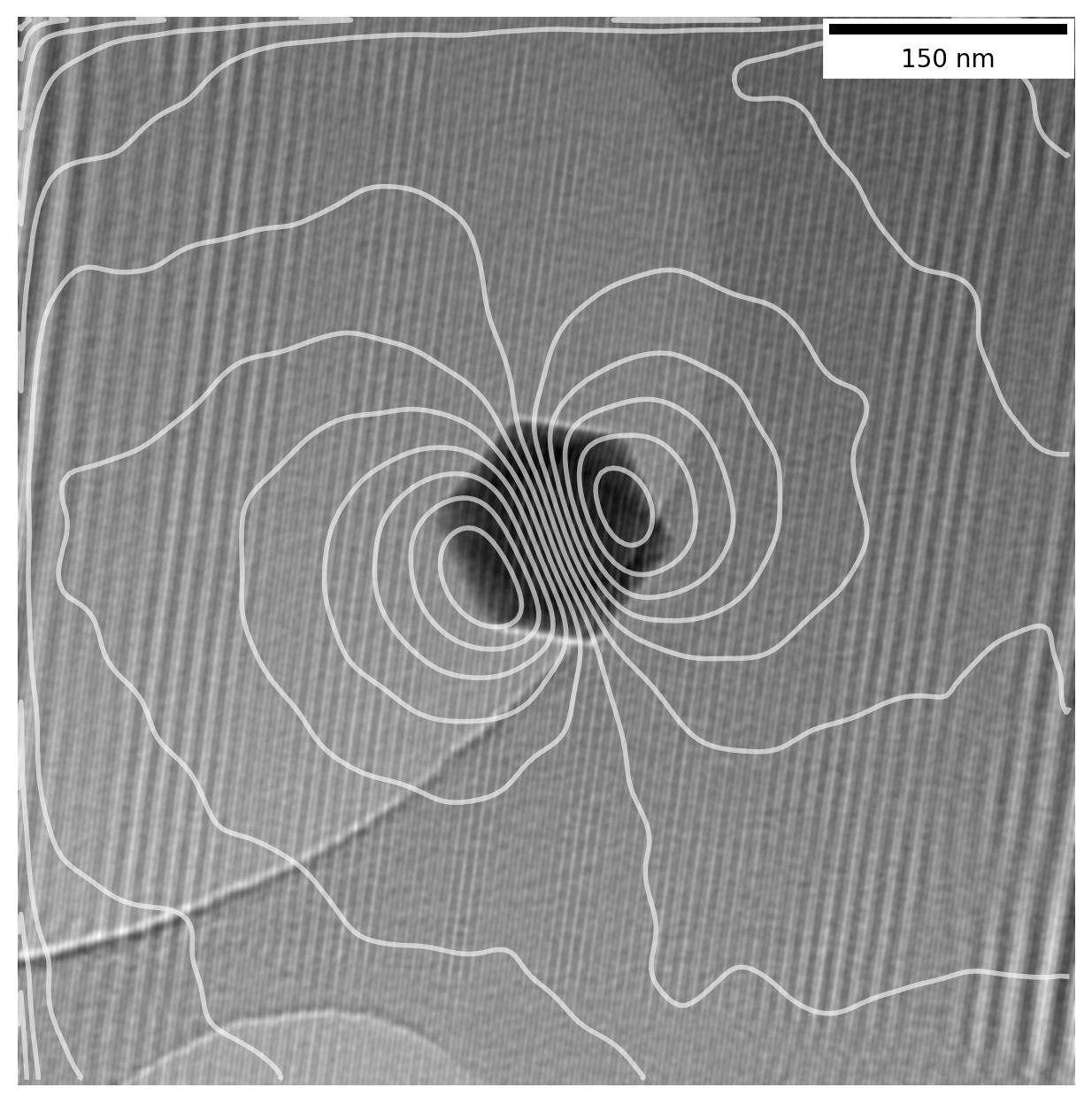
Contour lines representing the magnetic field lines can also be overlayed directly on top of the bright field image, letting us see the field lines emanating from the particle itself. Using a divergent colormap which shows the central values as white, while displaying values above and below that as blue and red respectively, we can enhance the readability of the phase image.
We just need to make sure we crop the bright field image in the same way so the centering is right.
# Apply a bit stronger blur to enhance contour lines
phi_m_extrafilt = crop_from_shifts(gaussian(phi_m_raw, 4), dx, dy, border=crop_border)
fig, ax = plt.subplots(1,2)

# Plot phase with divergent colormap, overlay contour lines
ax[0].imshow(phi_m, cmap='RdBu')
ax[0].contour(phi_m_extrafilt, 15, colors='k', alpha=0.5)
ax[0].axis('off')
scalebar = ScaleBar(pxsize_phase, pixel_unit, length_fraction=0.25)
ax[0].add_artist(scalebar)

# Crop BF image with same parameters as the phase image was cropped to get same center
bf_image = crop_from_shifts(sideband1_abs, dx, dy, border=crop_border)

# Overlay contours onto bright field image
ax[1].imshow(gaussian(bf_image, 1))
ax[1].contour(phi_m_extrafilt, 12, colors='white', linewidths=2, alpha=0.8)
ax[1].axis('off')
scalebar = ScaleBar(pxsize_phase, pixel_unit, length_fraction=0.25)
ax[1].add_artist(scalebar)
By plotting the contour lines we are in essence displaying the magnetic field lines as they emanate from the particle:
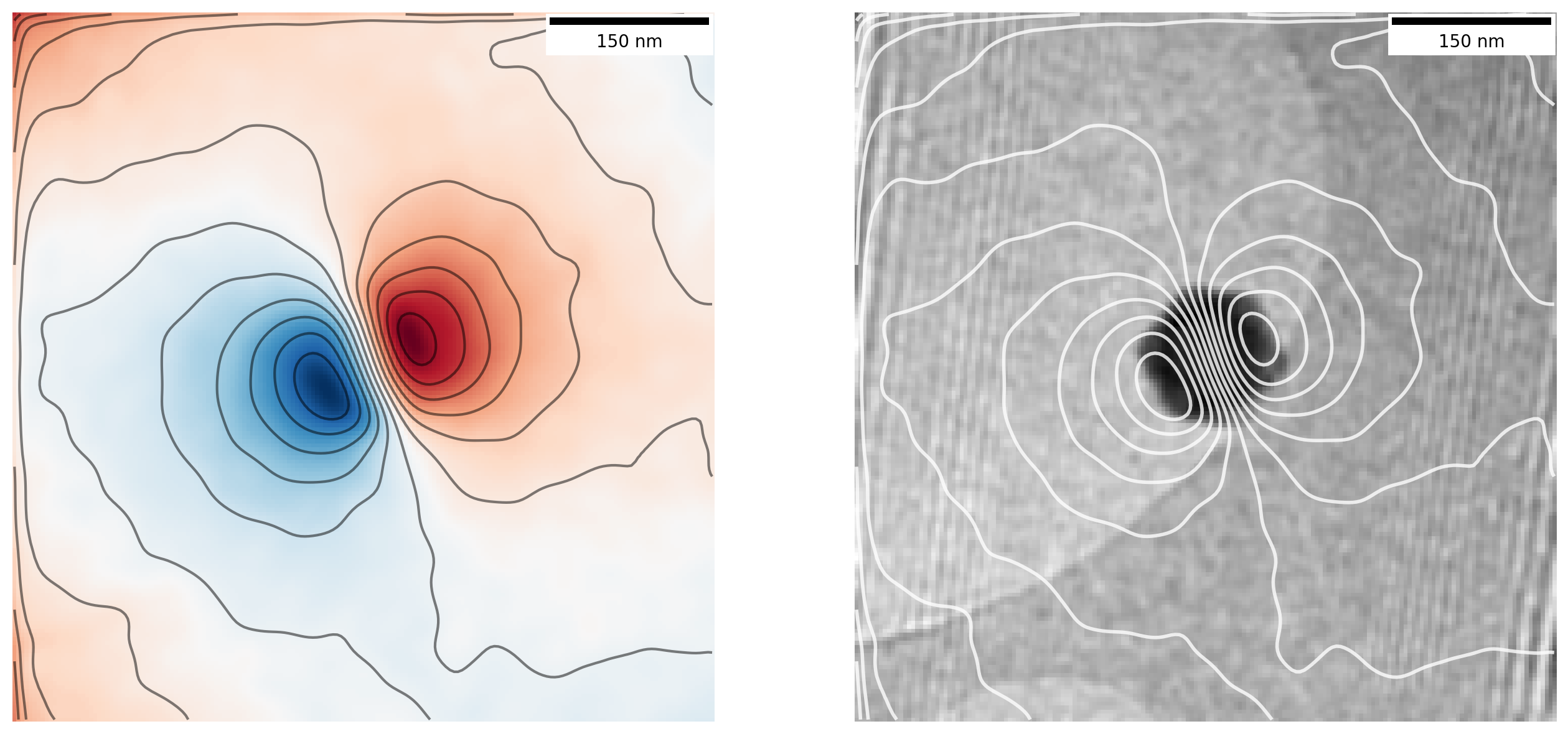
Now that is looking like proper magnetic field lines from a magnetic nanoparticle!
To enhance the image a bit, we will overlay the contour lines on top of the original hologram image so we get much better contrast. We do this by rescaling the magnetic phase image used for contour lines and again cropping parts of the orginal hologram to get the same center
from skimage.transform import rescale

# Increase resolution of phase image
scaling = im1.shape[0]/sideband_size
phi_m_upscaled = rescale(gaussian(phi_m, 5), scaling)

# Crop original image the same way as the sideband images were, correcting for scale
im1_crop = crop_from_shifts(im1, dx*scaling, dy*scaling, border=crop_border*scaling)
im1_filt = gaussian(im1_crop, 3)

plt.imshow(im1_filt)
plt.contour(phi_m_upscaled, 15, colors='white', linewidths=2, alpha=0.8)
Final thoughts
Congratulations for making it all the way through!
We have worked all the way from loading raw holograms taken in a Transmisison Electron Microscope into Python to extracting and visualizing a magnetic phase image by using various image processing techniques and a bit of Fourier transform magic.
There is still much that can be done with this data, such as calculations on the exact magnetization of the particle and how it compares to expected values from other sources, which I have skipped as this post is already running long. If you want to try the code yourself, make sure to download the associed Jupyter Notebook with data, where you can make your own calculations (preview of notebook).
While I have omitted many details on this complex topic, I hope it can server as an interesting appetizer on some of the things that can be done in Transmission Electron Microscopes, and how information that is usually not obtainable can be brought forward with some clever techniques.
-
Adapted from diagrams of the magnetic field around a bar magnet from Wikimedia Commons ↩
-
Supervisors: Takeshi Kasama, Marco Beleggia, Cathrine Frandsen. ↩
-
Takeshi Kasama, Rafal E. Dunin-Borkowski and Marco Beleggia (2011). Electron Holography of Magnetic Materials, Holography - Different Fields of Application, F. A. Ramirez (Ed.), IntechOpen, DOI: 10.5772/22366 ↩
-
All packages used in the notebook are:
numpy,matplotlib,ncenmpy,scikit-image(imports asskimage) andmatplotlib_scalebar. ↩ -
Remember that each pixel in the fourier transformed image
im1_fftconsists of complex values with a real value \(\mathrm{Re}\) and imaginary value \(\mathrm{Im}\). What we display as “the FFT” is the amplitude as \(r = \sqrt{\mathrm{Re}^2+\mathrm{Im}^2}\) usingnp.abs. Further, to avoid the central peak dominating the image I also calculate the logarithm of each pixel value withnp.logto enhance visibility of the smaller values in the sidebands relative to the peak, as well as adjustingvminandvmax. ↩ -
Even if the image is rotated and scaled this method can still be used as demonstrated in this example – essentially the matching is performed on the FFT of the image to obtain rotation, followed by the same method as here after correcting for rotation. ↩